
As most of you already know, I like to accumulate Bitcoin during bear markets, in accordance with the 4 year cycle theory.
In other words: my entries are based on time rather than on price. At the same time, I want to share certain indicators that people might consider following, especially during the pivotal moments of the cycles.
Remember, don’t base your investment decisions solely on technical indicators. But feel free to use them to reinforce or slightly steer your existing convictions.
The Puell Multiple
The Puell Multiple focuses on Bitcoin miners and their revenue.
In summary, it’s calculated as the daily issuance of $BTC divided by the 1Y MA (moving average) of daily issuance (both in $USD terms).
That gives us the orange line on the chart below.
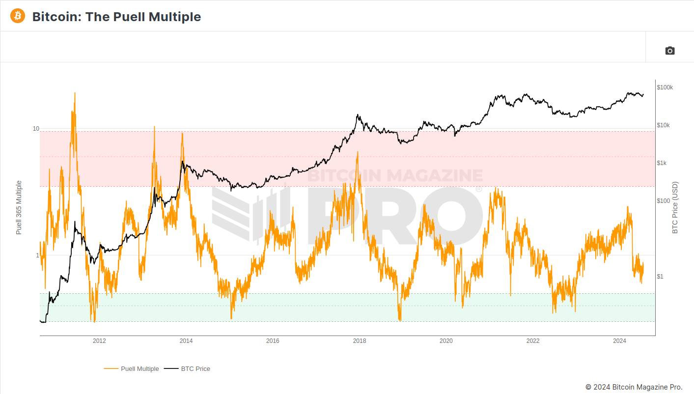
What the Puell Multiple tells us is that in periods where miners’ profitability is higher than its historical average (nearing or at the red zone), we might be around a local top.
On the other hand, it also shows that when mining profitability is lower (nearing or at the green zone), we’re bottoming out.
So far, this has perfectly coincided with the 4 year block reward cycles, which makes sense, as Bitcoin mining is less profitable at low prices and vice-versa.
Note the diminishing extremes. This is a note on not taking technical indicators for granted, as we might never enter a red zone again or experience a parabolic run such as those in the first couple of cycles.
Pi Cycle Top Indicator
The Pi Cycle Top indicator aims to forecast the cycle tops. In the past 3 cycles, it has done it within 3 days of each high (the vertical red dotted lines).
To do that, it relies on two moving averages:
- The 111 DMA (daily moving average) – the orange line
- The 350 DMA (daily moving average) x 2 – the green line
These cycle top forecast is determined by the intersection of these two moving averages, as it can be seen on the chart below.
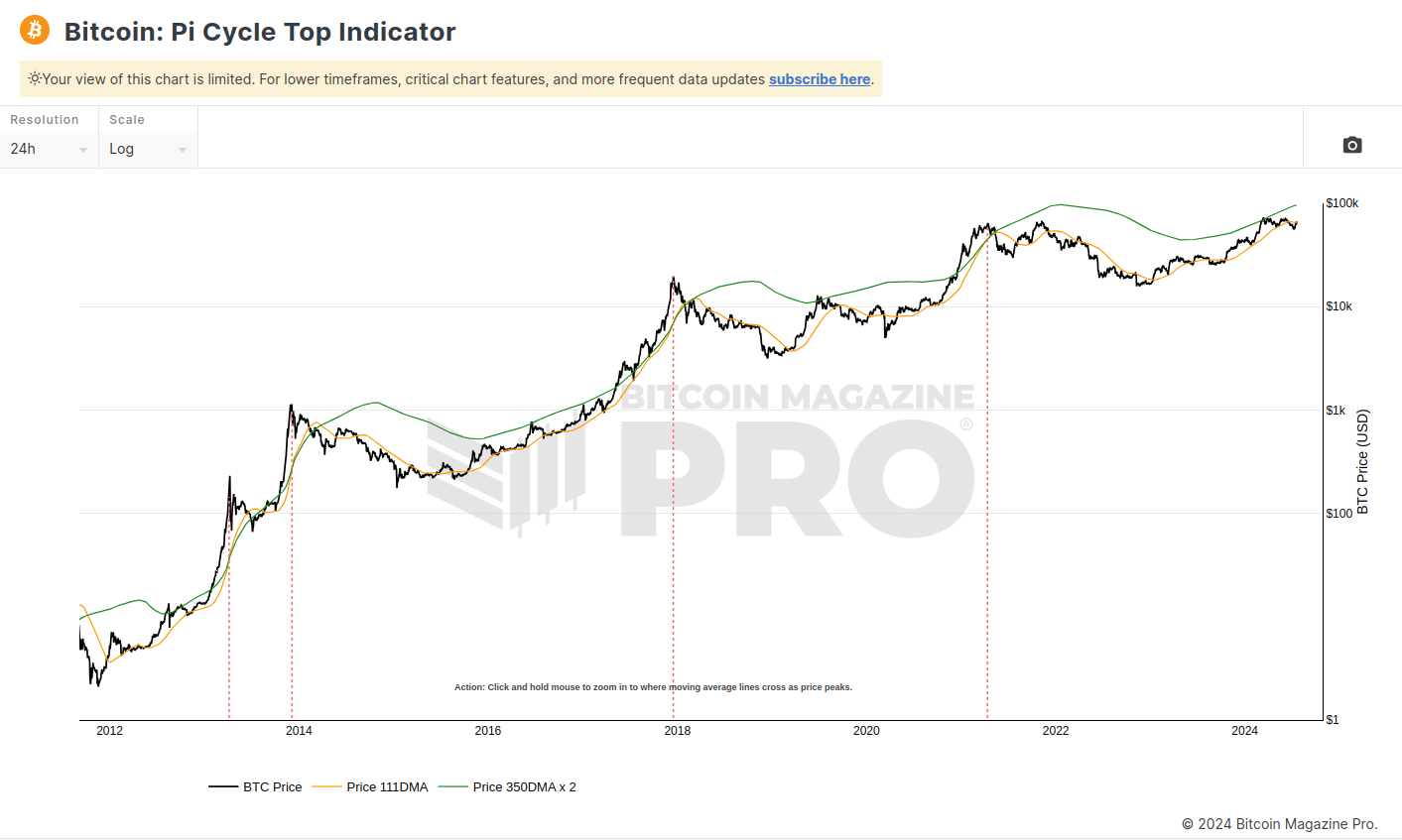
Of course, you should always keep in mind that any model can break.
That’s why I never recommend neither entering nor exiting a market with 100% of your funds. But rather a strategic cost averaging in and out approach, as I did in the previous cycles.
For example, below are my Bitcoin sell orders from the 2021 cycle and my buy orders from this cycle. See how distributed they are through time, but still complying with “buy low, sell high”:
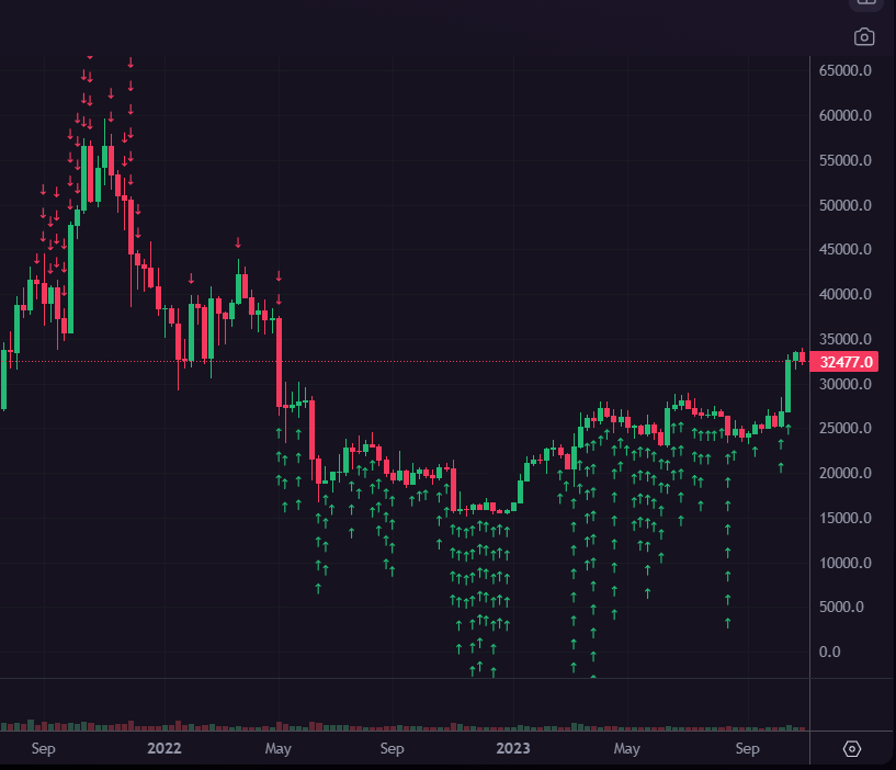
Note: I didn’t use any indicators for this, but basic timing based on the 4 year cycle thoery.
Still, it’s interesting to see how accurate some models can be throughout an asset’s history.
And some more interesting trivia (quote from bitcoinmagazinepro.com):
It is also interesting to note that 350 / 111 is 3.153, which is very close to Pi = 3.142. In fact, it is the closest we can get to Pi when dividing 350 by another whole number.
2 Year MA Multiplier
The 2-Year Moving Average Multiplier is an indicator which historically shows when the market is overheated or cold.
This is done by plotting the price chart with the 2Y MA (the green line) and the 5 x 2Y MA (the red line).
Historically, the green zone was great for Bitcoin accumulation.
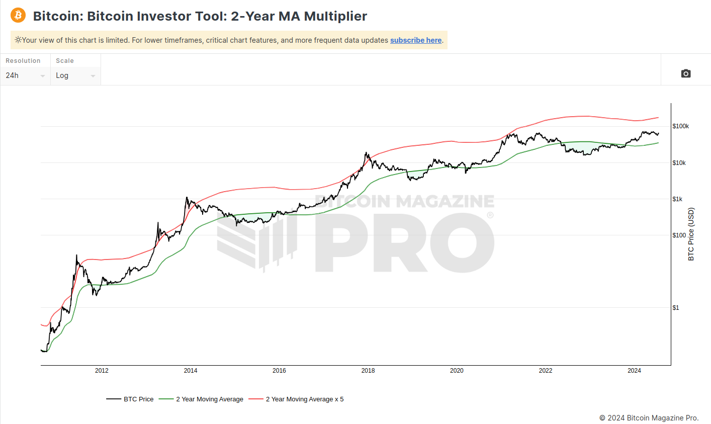
I want to point to the fact that the “overheated” region in the last cycle wasn’t as conclusive as in the previous ones (i.e. no red zone in 2021).
So this indicator already becomes obsolete, although the price breaking below the 2 year moving average still seems like a great buying opportunity for maximizing returns, compared to accumulating continuously.
Of course, again, a technical indicator for this is unnecessary because it’s all encapsulated in the Bitcoin block reward halving cycles.
Bonus: Fear and Greed Index
Unlike the other indicators, the Fear and Greed index can shift within a day. It’s way more short-term, so it isn’t suitable for multi-cycle accumulation or sell strategy.
However, it’s a fun one to track every now and then so I decided to include it.
The Fear and Greed Index relies on market sentiment to imply whether Bitcoin is overvalued or undervalued.
This is done by aggregating various types of data: from technical ($BTC’s volatility, volume, dominance, etc.) to natural language processing (social media posts’ sentiment, Google search trends, volume, etc.).
At the end, it’s normalized into a number from 0 to 100, where 0-25 represents extreme fear (red points) and 75-100 represents extreme greed (green points).
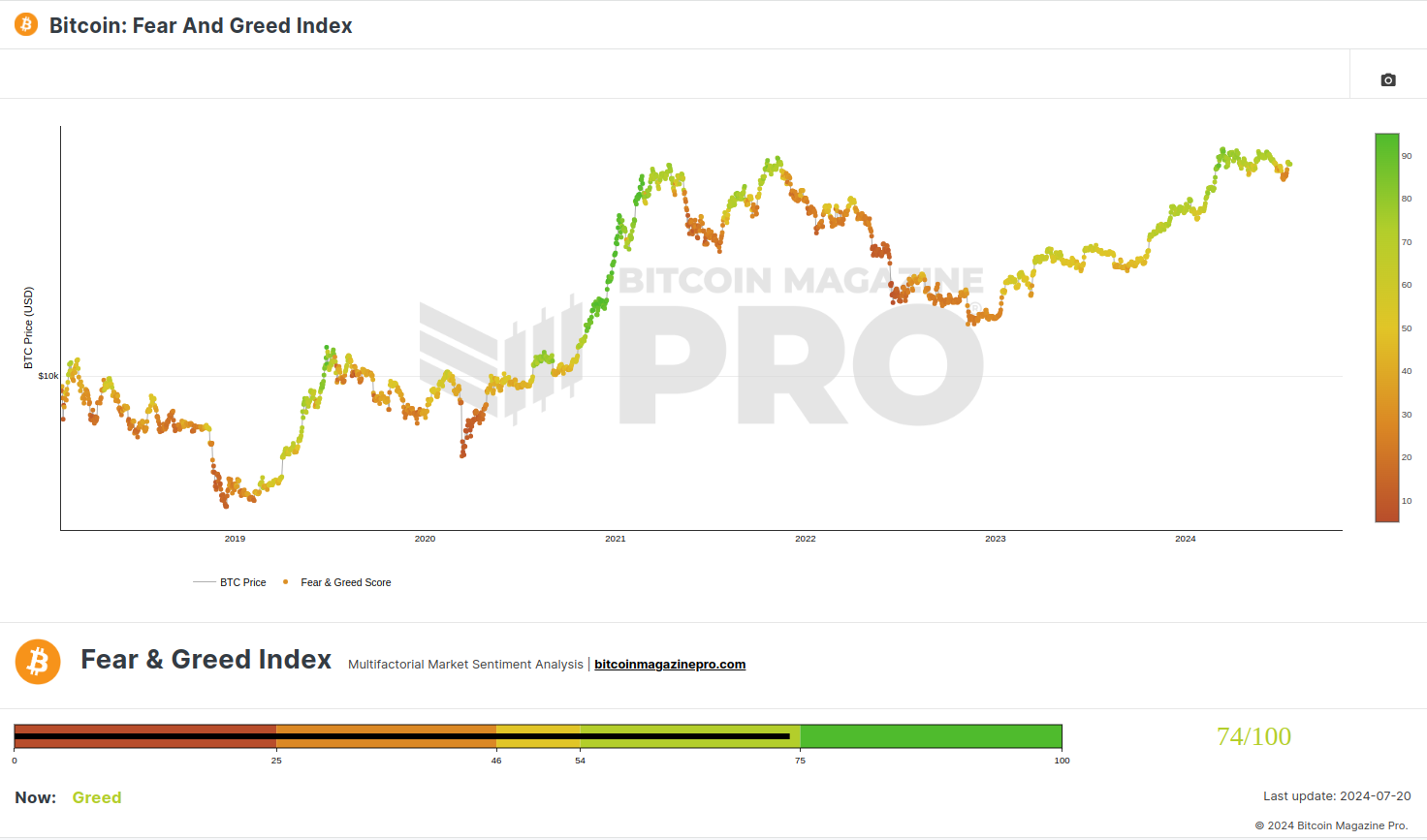
As you can see, bear markets are usually “reder” than bull markets. But at the same time, there are fearful periods during pullbacks in the bull market, so whoever buys those will bag-hold for 4 years before seeing any profit.
That’s why I don’t recommend trading based on the Fear and Greed Index, but you can keep an eye for short-term expectations.
Or ignore the price, self-custody, and HODL forever, supporting the largest revolution in human history.
Afterword
I said it in the beginning and I’ll say it again: consider that these models have zero predictive power.
Not that I completely discredit forecasting models, but whenever one breaks, you can always draw new lines and hope that it’ll work. This has been done with the rainbow chart, the stock-to-flow model, and many more – and we will see most current models fail as well.
So to end this post, I want you to repeat the following sentence 3 times:
Technical analysis is astrology for gamblers.
Thank you.
Author
-

D. Petkovski
📓 The Author Husband & Father
Software Engineer StrengthCentric
 ₿itcoin Hodler Long-Term Investor
🌍 Everything Enthusiast 🔥 Optimist
 Husband & Father
  Software Engineer

Related posts:
 The 4 Year Cycle – Bitcoin Price Prediction 📈
 Bitcoin Exit Strategy (Cycle Based Rotation)
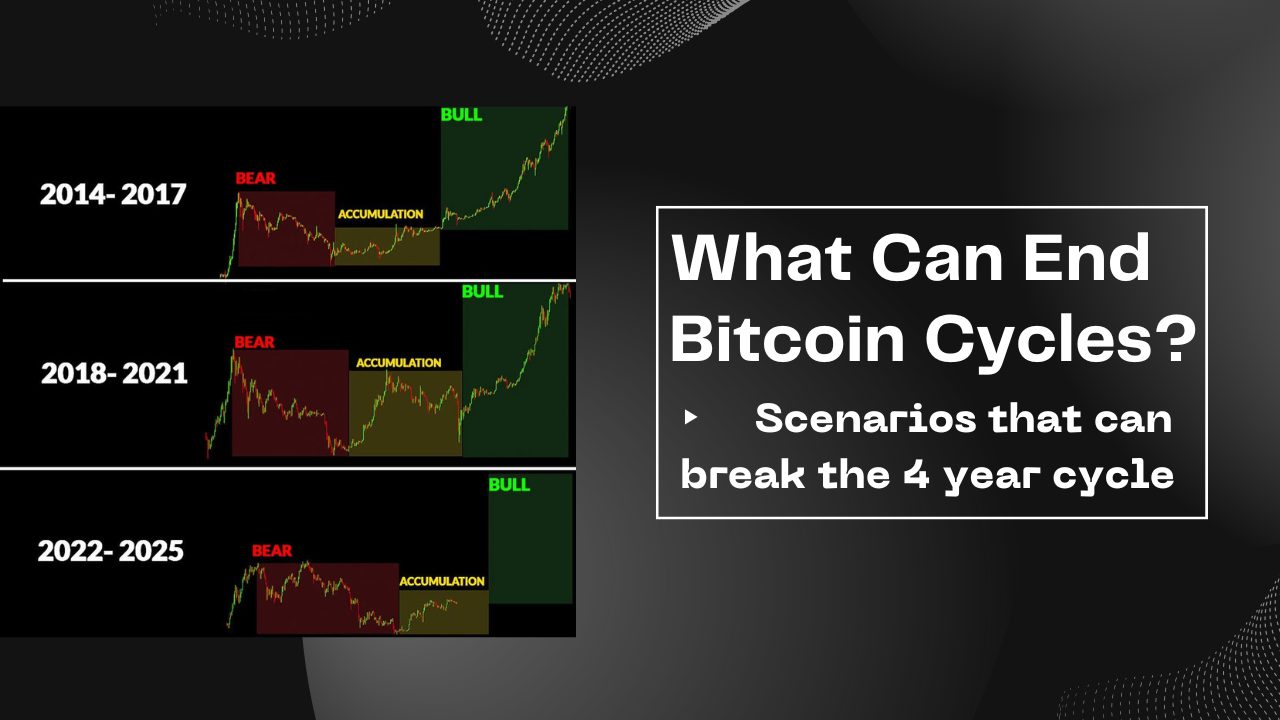 Can the 4 Year Cycle Break?
 Why I Stopped Covering “The Cycle”
 I Didn’t Get Lucky – The Opportunity in Bitcoin
 How I Accumulate Bitcoin During Bear Markets
 Can Bitcoin Reach One Million Dollars?
 Exit Into What? The Curious Case of Bitcoin
 Bitcoin Tax in All EU Countries (Capital Gains & Wealth Taxes) (2024)
 Market Cap vs Fully Diluted Valuation (FDV) – Explanation & Practical Analysis
 Tales From the Last Cycle – Exit Crypto in Profit
 Introduction to Hardware Wallets (Cold Storage for Beginners)
 Hardware Wallets Comparison (Trezor, BitBox02, Ledger, Coldcard)
 The Inevitability of Bitcoin
 The SEC Approved the Spot Bitcoin ETF